 How do you choose a wall decal color? There are 30-60 wall sticker color options and you have to pick
JUST ONE! Read on for help in deciding on the best wall sticker color
choice.
How do you choose a wall decal color? There are 30-60 wall sticker color options and you have to pick
JUST ONE! Read on for help in deciding on the best wall sticker color
choice.
1. Look at what surface color you are
putting the wall sticker on. Is your wall color a darker color
(burgundy, dark brown, or burnt orange), or a lighter shade (white,
beige, light gray, pastel blue)? The medium shades, like tan, can be a
little more tricky.
*Remember, if you have just painted your wall, you
will need to allow the paint to cure for 2 weeks before applying wall
decals. This curing process will make it easier to remove the wall
decal without harming your paint.
2. Now you need to consider what effect you want for your wall
decal. Do you want the wall decal to POP and really stand out on the
wall? Or do you prefer a muted, almost blended, design?
3. Go ahead and choose a color! If you want a wall
decal that will POP, you want to pick a contrasting color choice.
Example: Placing a white wall decal on a dark brown wall, as shown
above left. Your eye is instantly drawn to the PLAY BALL wall decal because
it stands out nicely!
4. If you want the wall decal to be more muted, you will pick
something that is a little closer to your wall color. Example: a light
grey wall decal on a medium gray wall. Ideal wall decals in this case,
would be floral wall decals or art wall sticker designs that you want
to be appear more like wallpaper or a mural. Our
vintage floral wall stickers is great example of this.
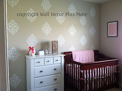 |
| Here is an example of a light wall decal (White) placed on a medium shade wall. |
5. If you have a simple photo editing program on your computer, you
can get an idea of how your wall decal will look also. Do this by
starting with a square or background color the same as your wall. Then
add some text in your wall decal color choice. Now you can see if the
wall decal "pops" or "blends". Try a few different colors to see which
looks best. Keep in mind, this digital preview does not factor in
lighting variances, which can also affect how your wall decal will
appear on the wall.
The key in choosing a wall decal color is in the CONTRAST. Make sure there is a contrast between your wall decal color and your wall color.
On a side note, be wary of glossy wall decals! They are a cheaper quality material that can harm your walls. But they can also mess up how well they look on the wall. The lighting in your room varies the appearance of glossy wall decals, and it makes planning much more difficult.
I hope this helps you decide on a wall sticker color, and come check out Wall Decor Plus More for a large variety of sticker choices!
~ Cassie
No comments:
Post a Comment